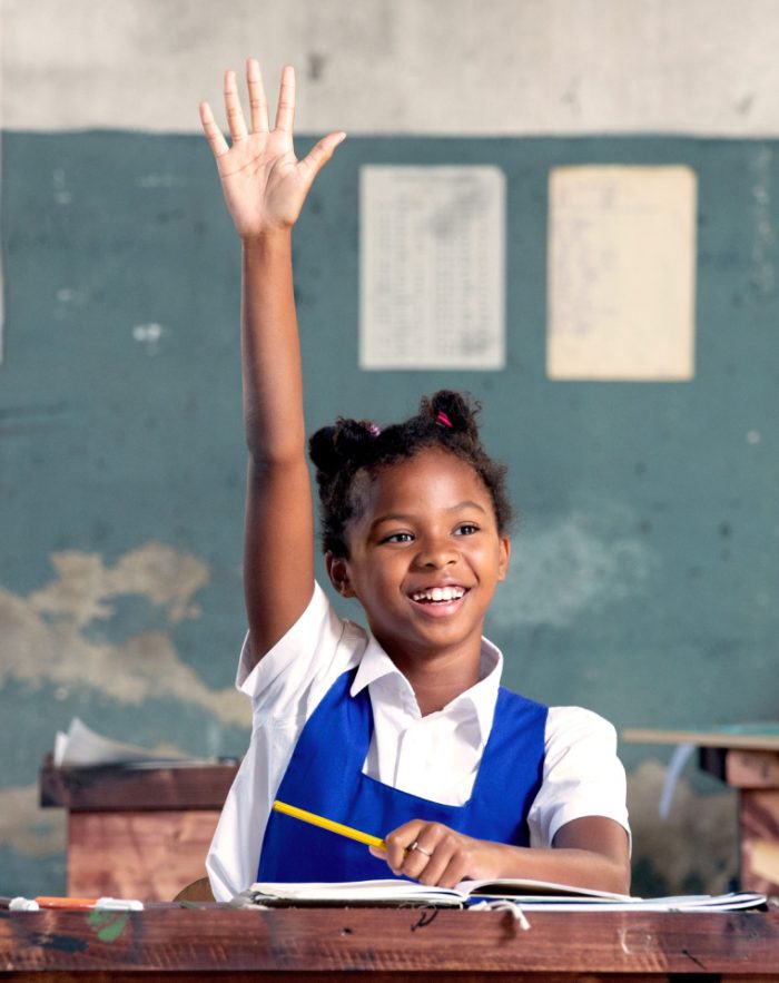
Certainly not EIF (European Investment Fund), a financial institution that is part of the European Investment Bank and facilitates the financing of small and medium-sized enterprises to support their creation, growth and development.
EIF was very clear about its identity: exuberant, out-of-the-box, fresh, on par with the young and dynamic companies they're addressing and a far cry from the stereotypical cold and stuffy businessman. They were searching for a partner capable of embracing this vision and giving life and soul to their unconventional identity, without compromising credibility.
Blossom wanted to bring other adventurers on its journey with EIF. For the annual reports, we worked alongside prestigious illustrators (under Blossom’s artistic direction) capable of seeing reality with the same unconventional perspective as EIF and of breathing life into the reports with a strong visual style: recognisable, playful, but assertive, too. So that EIF could finally reveal its true self to the world.


Sharpen your eyesight, find the character wearing the EIF T-shirt and click on it.

Blossom has also developed thematic campaigns launched by EIF to communicate different messages to diverse target audiences, mainly through social media. The aim was to present complex topics linked to the financial world in a simple and appealing way, remaining faithful to EIF's distinct personality. The bar was getting higher. And the challenge all the more appealing.
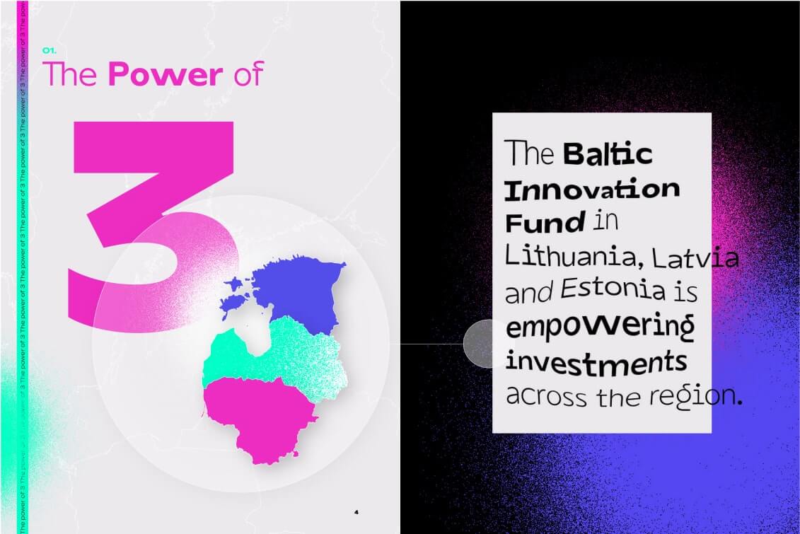
The campaign for the Baltic Innovation Fund (BIF) launched by EIF was directed at the world of finance and entrepreneurs and sought to highlight the Balkan region as a prime spot for investing.
The concept of growth in the Balkan region – made possible through investments – was represented with a very strong visual metaphor: three drops of water, in the shape of Estonia, Latvia and Lithuania, which join together to become a single larger drop.
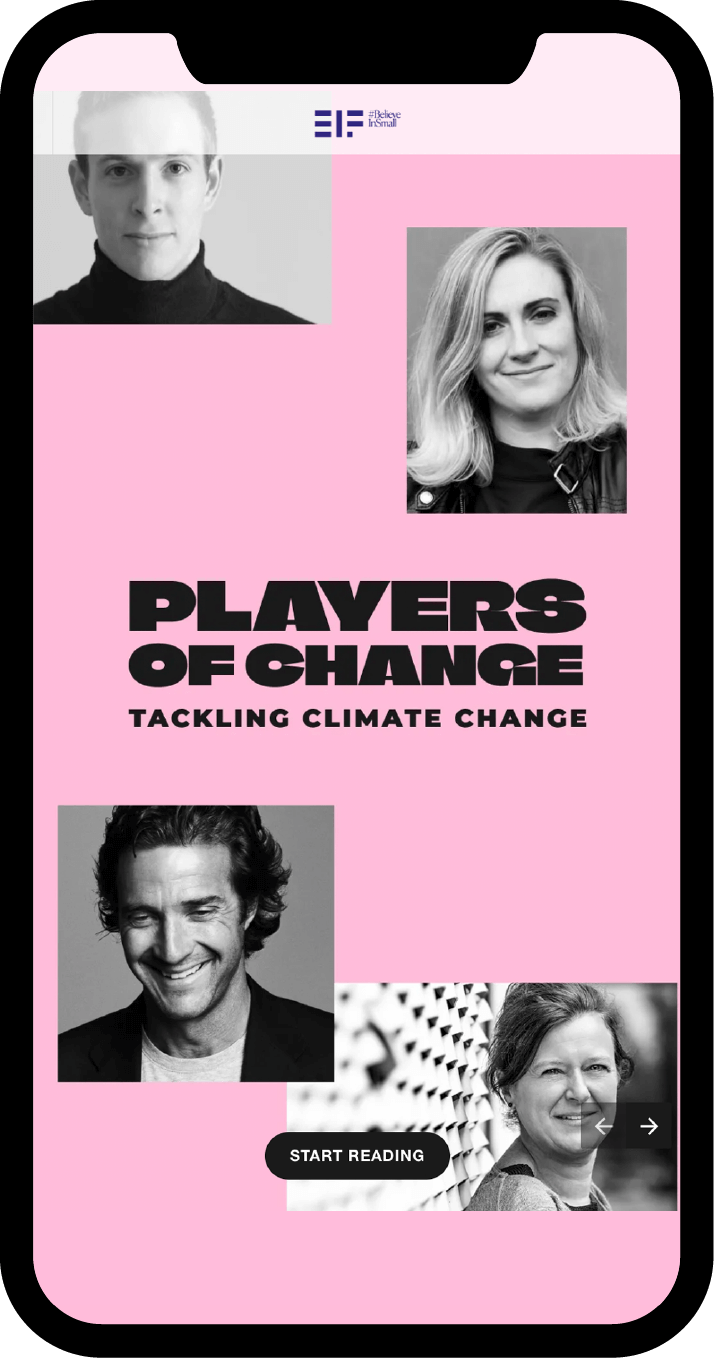
The goal of this campaign was to show how small and medium-sized enterprises play a key role in the fight against climate change.
To convey the idea, Blossom came up with a powerful concept to showcase small and medium-sized enterprises doing their part.
We created a strong headline Players of Change and utilized eye-catching typography to communicate the theme of climate change impact in a single glance. All combined with clean and bold graphics to highlight messages and the human element.
Climate Crisis is a font specifically designed to address climate change issues. Using different weights, the font symbolises the melting of glaciers from 1979 to 2020.
In the Players of Change campaign, the Climate Crisis font was used in its most "deteriorated" version for keywords related to negative concepts, while the most "complete" version was used for positive concepts.
On this journey we’ve embarked upon together, EIF has given Blossom a wealth of ideas to work with and the freedom to experiment and propose out-of-the-box solutions. At the same time, Blossom has contributed boundless creativity and strategic vision, helping change the way we talk about finance and positioning EIF uniquely in the financial world. It's not easy to find someone who will listen to you and understand your vision. Blossom and EIF met, got to know one another, and found common ground.